
Published
11/20/2024, 10:09“2GIS has always been a b2c product, a service for city residents: search for companies, places and navigation. But we also have 2GIS Pro, our new product for companies.
“2GIS Pro” is a tool for analysis and visualization of data on the map. It turns a huge amount of data into easy-to-analyze formats and helps to test hypotheses, identify trends and find insights for making business decisions.
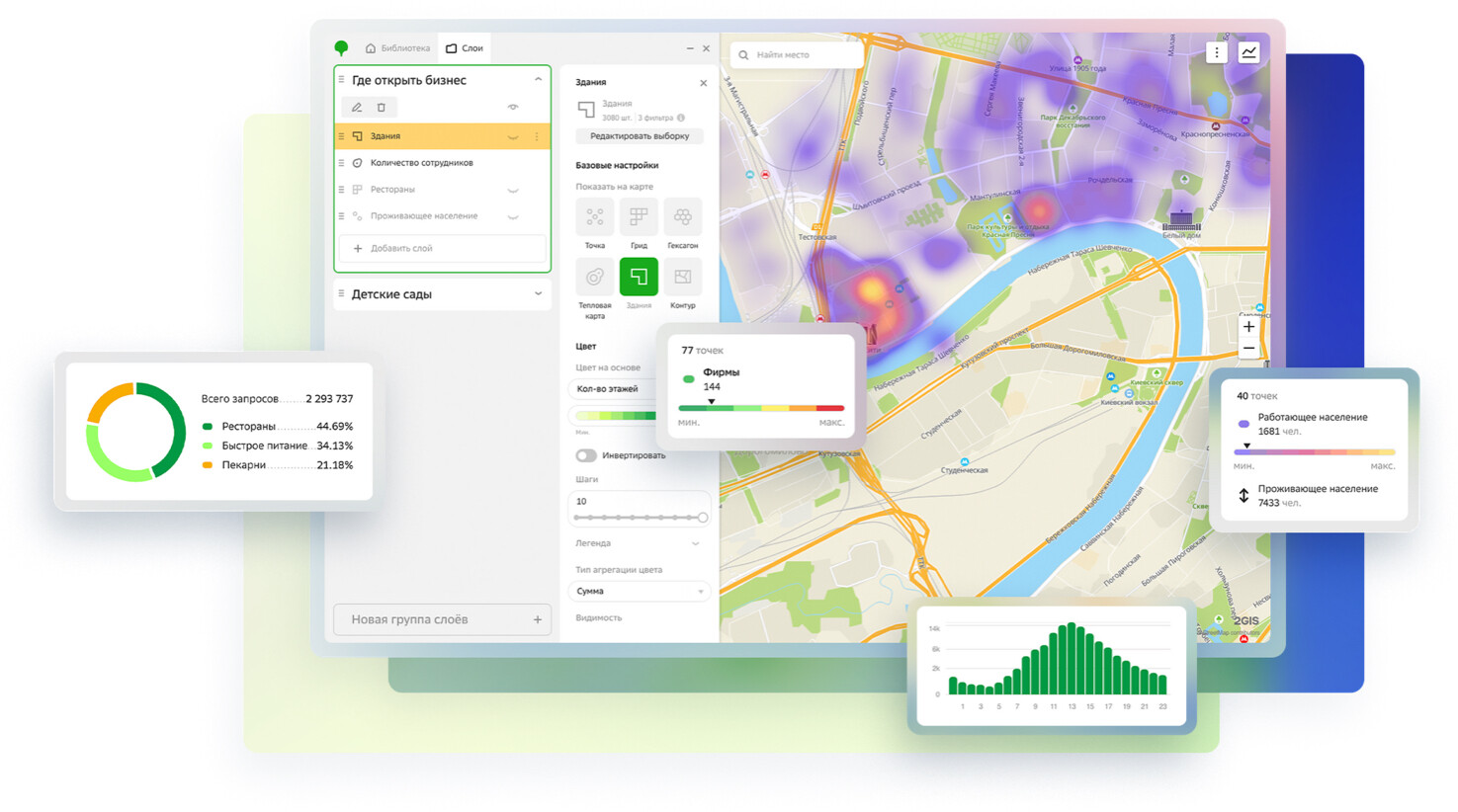
2GIS Pro has a simple interface for professional systems. While developing it, we kept in mind the idea that finding a place to open a restaurant should be as easy as finding a restaurant to eat at. And we believe that we will help both start-up entrepreneurs who are just preparing to open a restaurant and companies with a large staff of analysts.
Data to analyze
We're always very reverent about data. In addition to their volume, we are proud of the fact that some knowledge about the city is only available in 2GIS. And, of course, we make sure they are accurate. “2GIS Pro gives us almost complete access to everything we collect.
Organizations. There are 94.7 thousand organizations in 2GIS databases. In addition to the data published in our custom products, we know a lot of specialized information: legal names of each company, number of employees, TINs, etc.
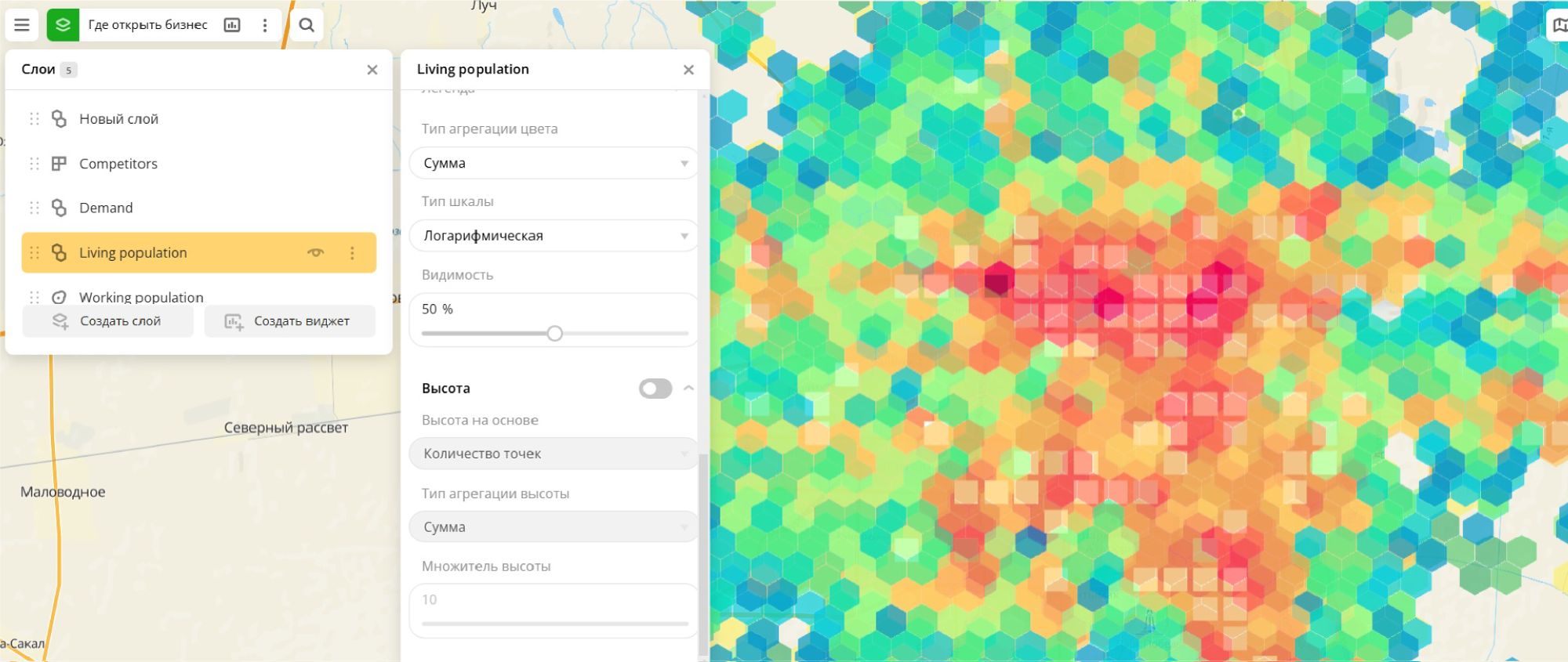
Geo-objects. A city is also buildings, roads, parking lots, paths and other objects that surround us. And each has its own characteristics.
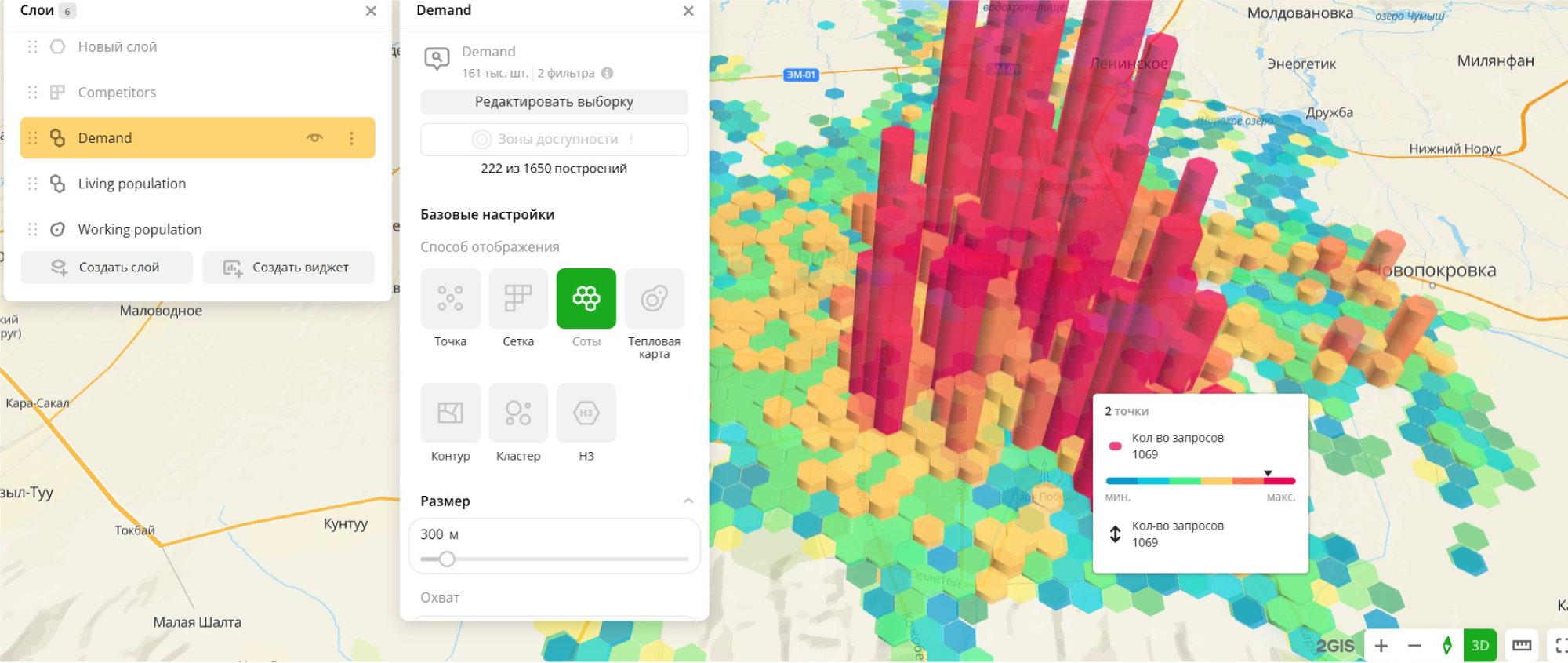
Queries. Across all business areas, we provide demand data based on millions of daily 2GIS user queries.
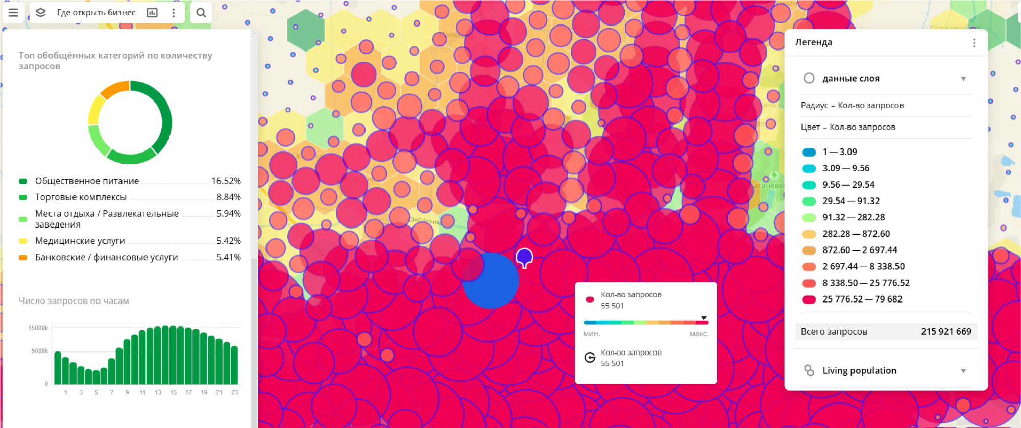
Business opportunities
“2GIS Pro” allows you to analyze the market thanks to simultaneous work with several layers of data at once. To solve one of the main tasks of any business “where to open?”, you can start by taking a layer with competitors and comparing it to the density of residents.
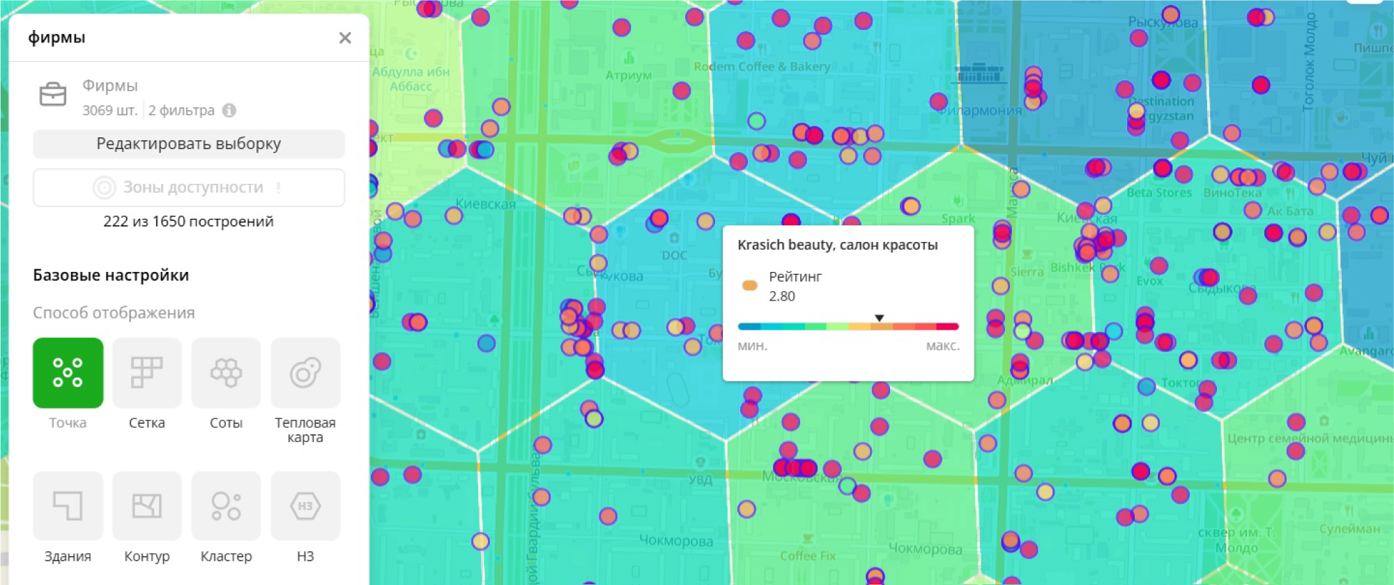
Or, when you need to open a beauty salon, you can look at the user demand for these services (heat map) and compare it to how many competing companies (dots) are in that location and what their rating is (dot color).
Visualization tools
Different data presentation formats can be used for visualization.
Each visualization format helps in specific situations - it depends on your needs.
If you are familiar with spatial analytics, you will be able to find the right format. Non-specialists may be confused at first, so let's make a small excursion without going into technical details.
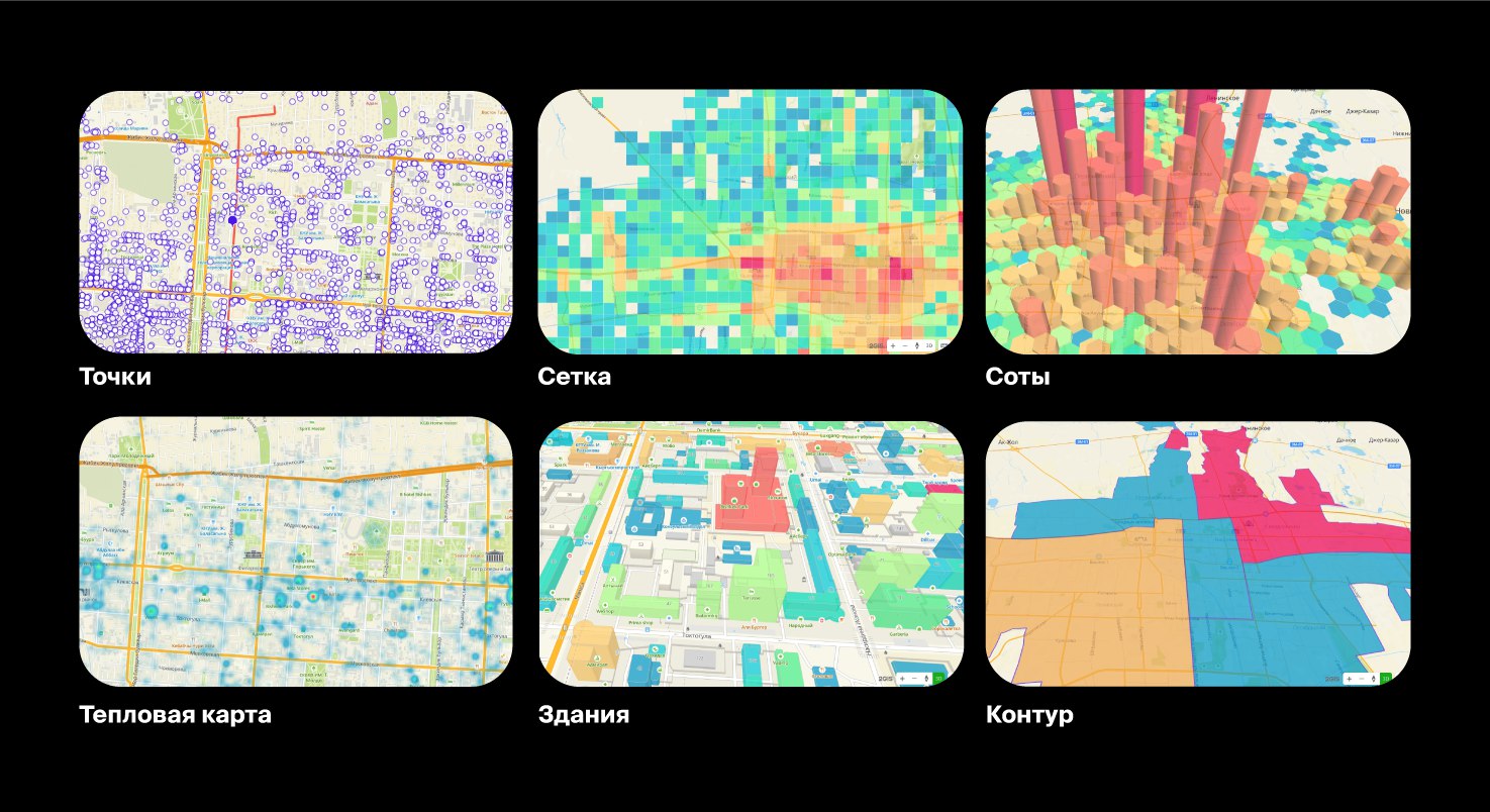
Grid and honeycomb
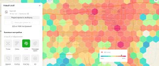
These are site analysis tools. They are used to identify differences between plots. The area is divided into equal areas (grid or honeycomb), each of which is displayed based on the value of the selected criterion
There is no fundamental difference between a honeycomb and a grid. These figures are created automatically, and the algorithms inside them work in the same way. It is convenient to use them together when you need to see two layers with aggregated data: for example, to display the average check in one layer and the number of employees in the second layer.
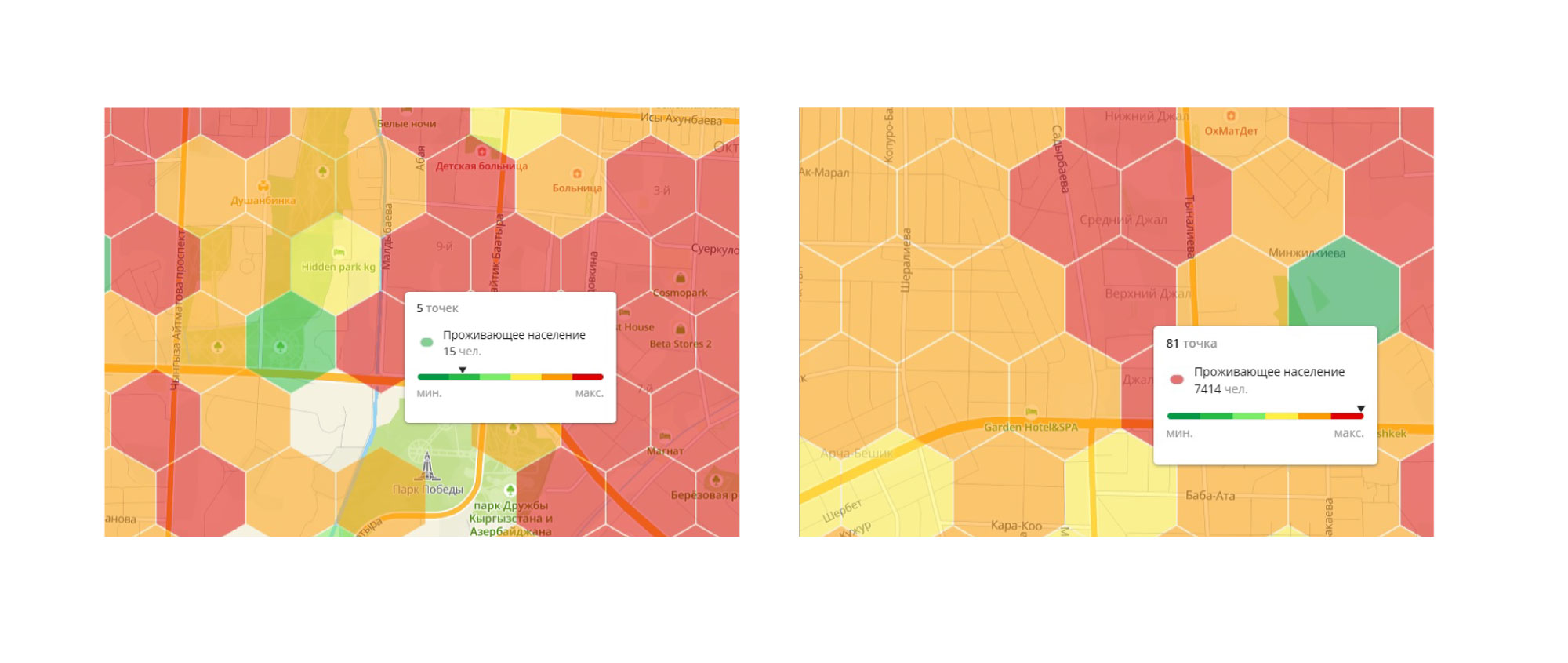
The data is aggregated and evenly distributed over the entire area within its boundaries. Because of this, you can miss minimum and maximum values that differ significantly from the average. Very roughly: if for half of the objects the attribute value is 1 and for the other half it is 9, when we choose to aggregate by the average we will get 5, and we can draw the erroneous conclusion that in this area all values are equal to the average.
Contour and buildings
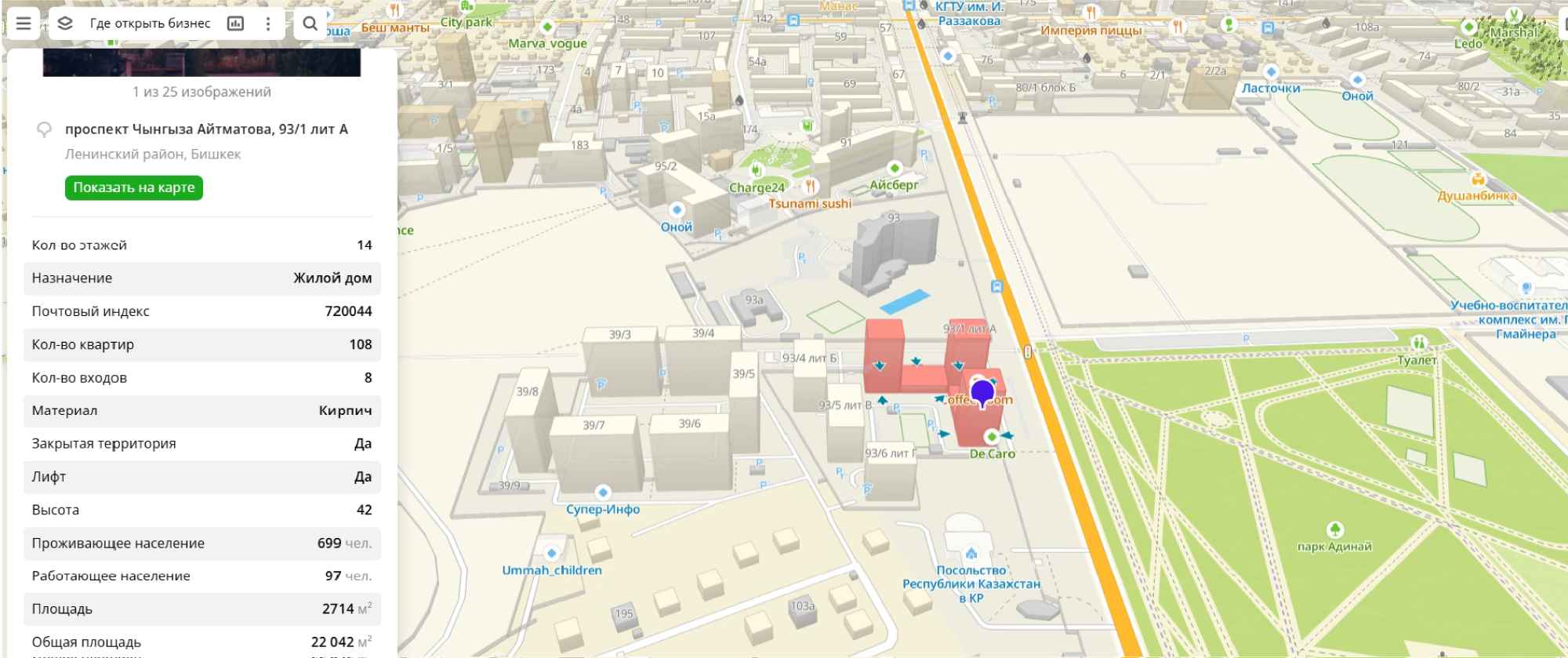
Unlike honeycomb and grid, buildings and contours take into account physical and legal boundaries. They can be used to see, for example, the distribution of buildings by height.
Or the most built-up neighborhood in Bishkek.
Heat map
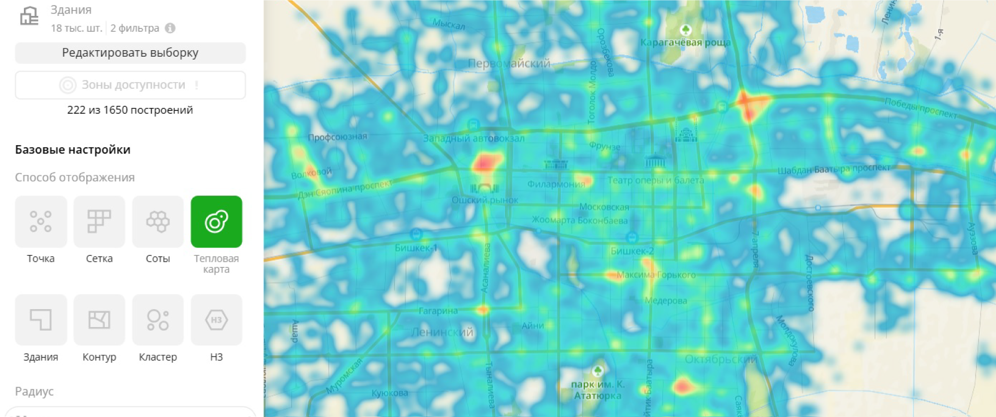
A heat map is suitable for cases when you need to identify some concentrations: a large attribute value or vice versa - voids. In a heat map, the distribution is uneven, more smooth, unlike area objects.
Points
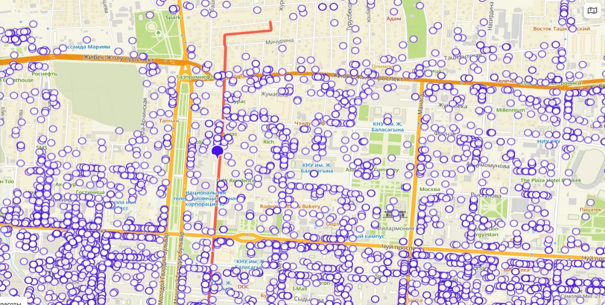
Points help when you need to show separate elements, but it is important to preserve their individuality. The key word here is “show”, because these points are not aggregated in any way and do not cluster at large scales.
Each point has two independent variables: color and size. For example, the number of branches in the network and the average rating.
Algorithms and technology
We pay a lot of attention to technology and algorithms. “2GIS Pro” runs on our WebGL map, which allows us to work with this data very quickly. The same allows you to see any information at any scale.
Available
“2GIS Pro” together with the API and SDK has completed the set of technologies and products for developers and businesses facing challenges related to mapping, logistics and navigation.
2GIS Pro is free in the demo stage. And for large tasks, the possibility of customized solutions, including uploading your own data and customizing the interface, is already available.
